Thursday, 19 March 2015

Typography


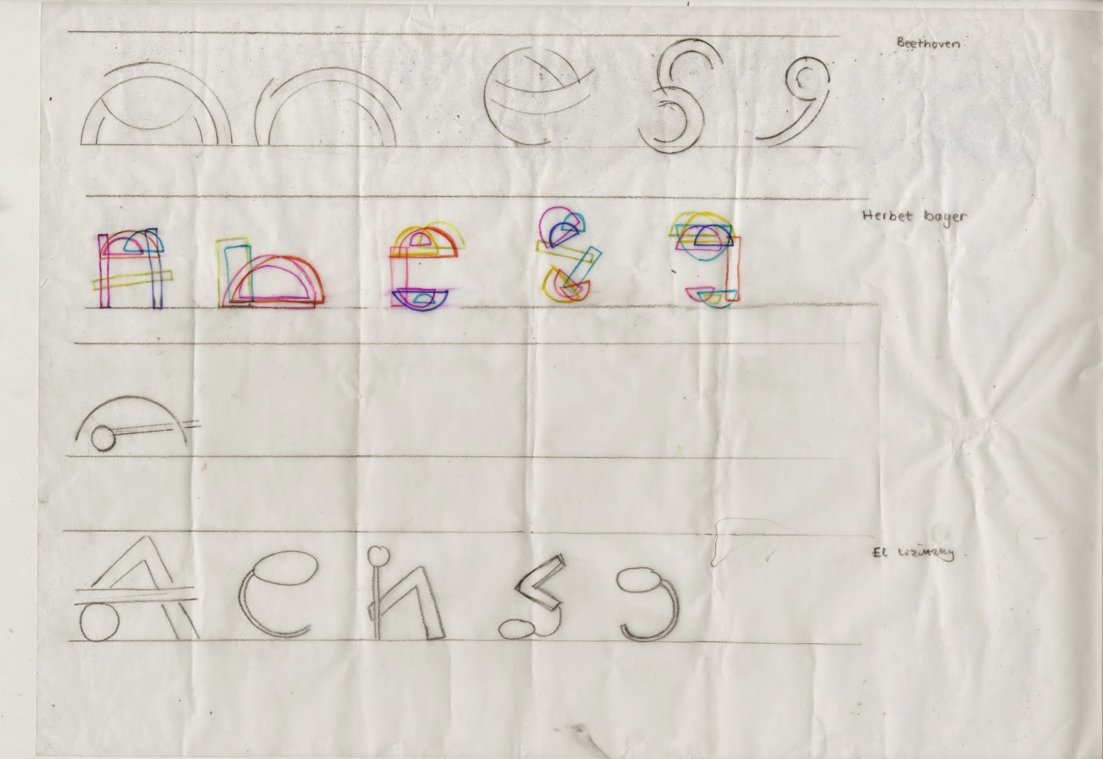
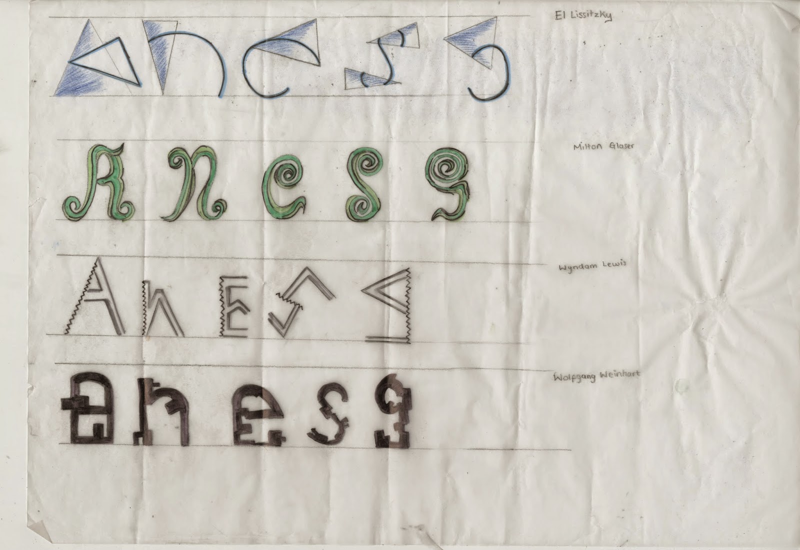
This is one small brief I actually have enjoyed to create our own Font. We was asked to look at different artists work as inspiration and from their work to look at the shapes and patterns which we were then to form the letters A,N,E,S,G. using these. The reason we has to start of with these specific letters was to see if they would work well enough to create the whole alphabet. I started using different mediums, materials and techniques to create my experiments e,g, compass to get a perfect round, rulers for the straight lines, I used fine liners and watercolors to create shadows of light and dark. I used different artist's work to get a mixed outcome with my experimentation's, as I then had a variety of shapes and materials to be working from. 
Experimentation sheet 1

Experimentation sheet 2

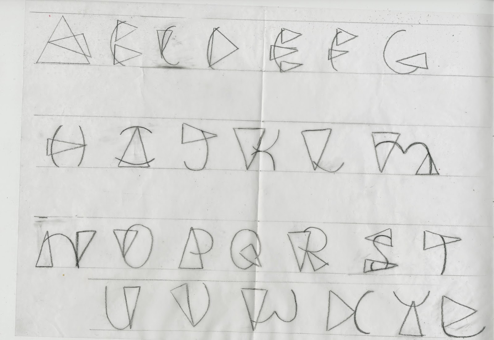
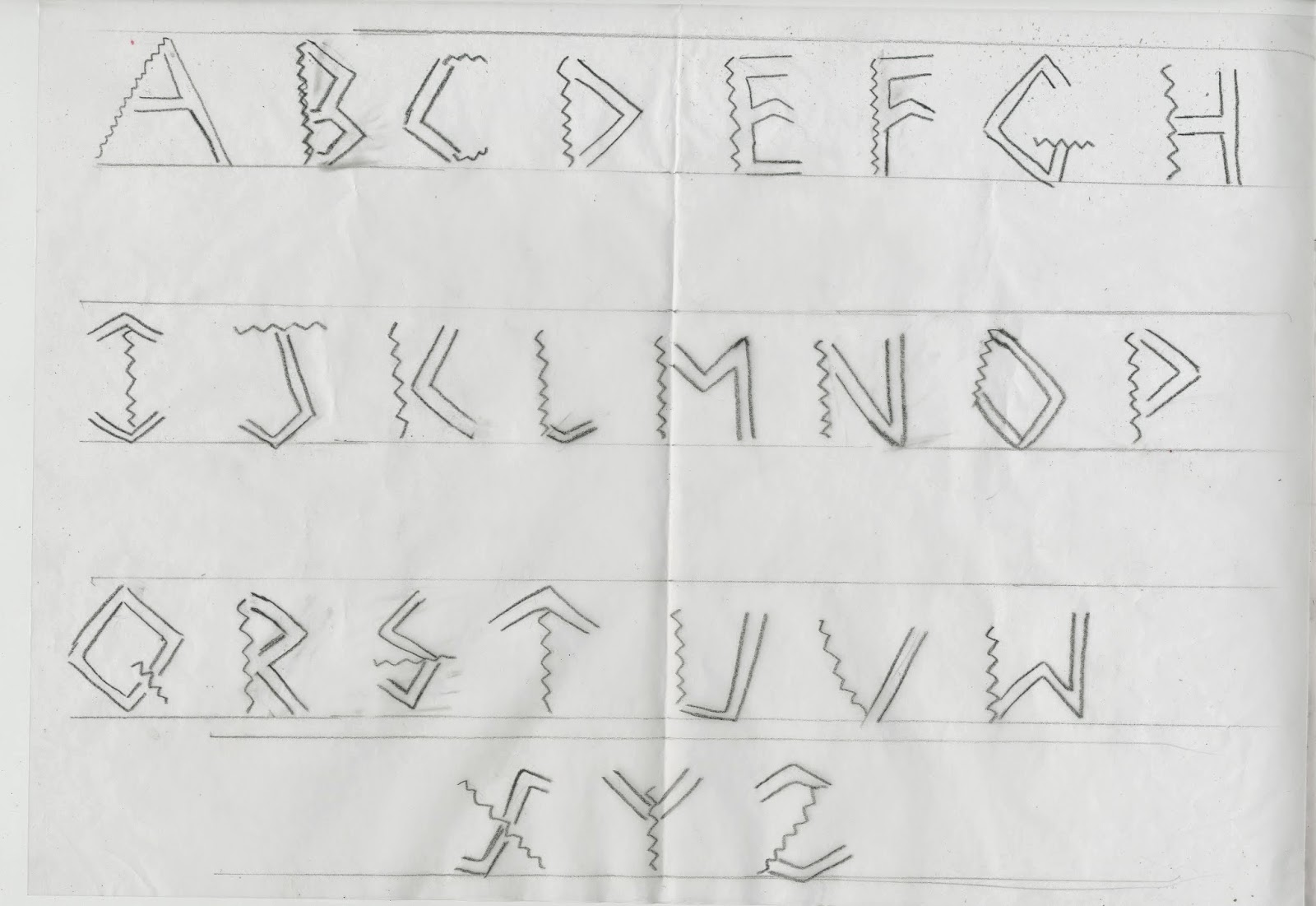
After creating an array of experiments of which I was happy enough to work with my next step was to create 3 full alphabets from these experiments. I choose my 3 favorite's 2 inspired by El Lissitzky and one by Wyndom Lewis. 
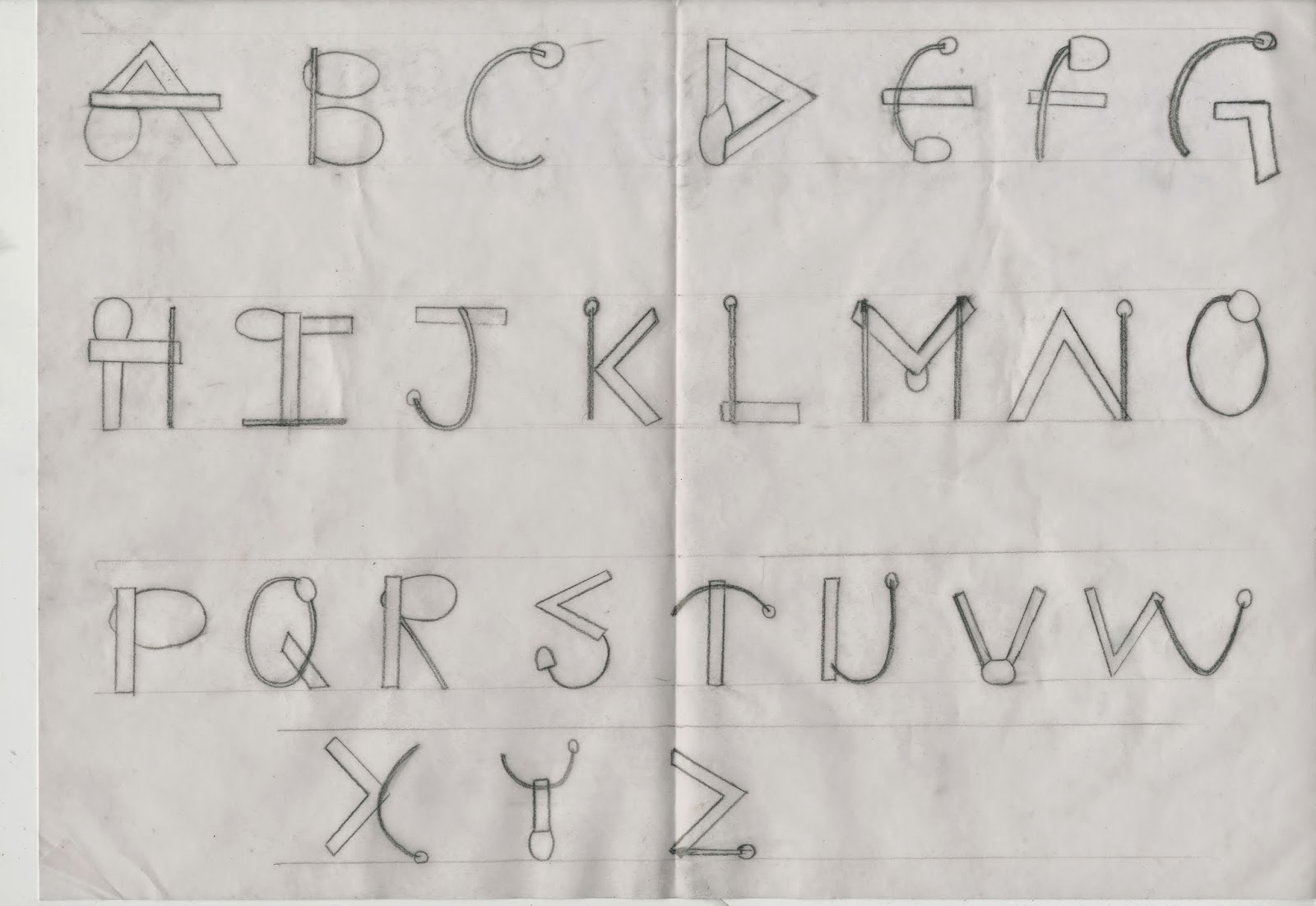
El Lissitzky Inspired Type Font

El Lissitzky Inspired Type Font

Wyndom Lewis Inspired Type font
Once I had completed all 3 type fonts I had then choose which I felt was the best one and my main favorite which was inspired by El Lissizky's work.


 This image above is what inspired my type font. Using the different shapes and curves I merged them both together within each letter, using the thin lines as well as the thin. I also used the aspects of the curvy lines as well as the straight. Inserting the similar shapes into my font with the use of the circles.
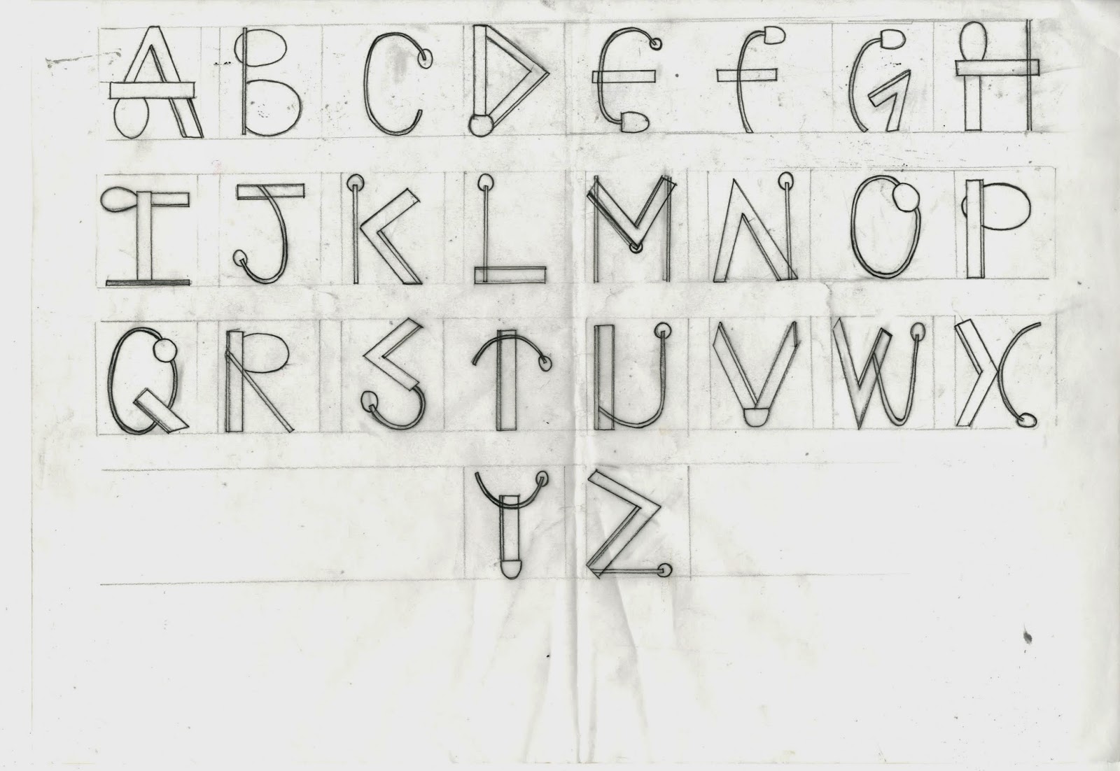
  
Final Type
Once choosing which design I decided to have as my final I once again drew a sketch of the whole alphabet in the same type font but much more precisely using a ruler and going over the final in black fine-liner.Boxing out each letter making them the same size.
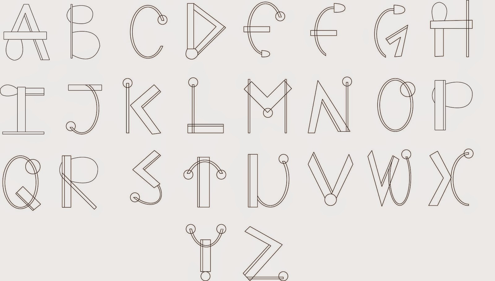
Final digital Type
The next step after I finalized my type font I scanned in the sheet and using Adobe Illustrator I drew out each letter using the pen tool and the line tool. To create the perfect circles I also used the ellipse tool. This gave me a smart and neat look to my finished type. Using Illustrator In the process and production classes have helped me a lot in understand and using the software which I now find better and much more easier to use than pen-tooling on Photoshop.

Wednesday, 18 March 2015

Graphic Design Timeline (Link)

Looking at the timeline within the Art and Design history I Came across a site of the Graphic design timeline, which explains the movements the artists around and the events around on the timeline. I find this useful to gain some background history but also love the layout of the site and how Its explained in simple terms and is't over complicated or over crowded with information.

http://gdh.2rsolutions.cz/

Thursday, 12 March 2015

Kinectic Typography

As part of the after effect workshop I missed kinectic typography due to the weather stopping me to travel. So I caught up on this at home in my own time. And I feel I have done quite a good job. I used the help ofYoutube tutorials to enable sound whilst editing. As I had recently watched fast and furious 7 the song It's been a long day was in my head so i decided to do kinectic typography besed on the first line for this. So I downloded the audio track from a copyright free source I had found and imported just the first line into Adobe after effects. Matvhing the words to the exact time sequence was quite hard and very time consuming . Using the different effect to create the words flying in from all over the screen I feel I did pretty well as a final outcome which I am actually pleased with.


Kinetic Typography from Itba Kauser on Vimeo.

Wednesday, 11 March 2015

Avant Garde

In the first half today's Seminar we was introduced to the historic modern art type face Avant Garde. In the second half of the seminar we were briefly introduced to the art design styles and movement timeline. Below are my Notes from that seminar.

Lecture Notes

Lecture Notes
Inspired by the Avant Garde Typeface I decided to do some research of my own of the type face itself.
Name of the font in the typeface


Different mediums to the font

 Avant Garde was originally created by Herb Lubalim for the cover of a Magazine for his own design firm called Herb Lubalim incorporation. This typeface was originally designed to be a commercial typeface being a logo for a magazine. This was later developed by himself and Tom Carnase to become it's very own Typeface.


"Lubalin’s letterforms with tight-fitting combinations reflected Ginzburg’s desire to capture “the advanced, the innovative, the creative.” The character fit was so perfectly tight that they created a futuristic, instantly recognizable identity for the publication." - http://www.thinkingforaliving.org/archives/147


My experiments inspired by the original typeface

As I was influenced by the style of Avant Garde I experimented with the style using different fonts to which I manipulated the kerning, sizing of the characters low key lettering and adding the Italic to the first letters to get the slanted effect of the Avant Garde.

For the first 3 I used the font Britannic Bold experimenting with how it would look in Low key lettering as well as in Capitals.

The middle 2 I used the font Calibri adjusting the kerning and the sizing of the lettering.

The last My favourite out of them all I used the Font Century Gothic. this I feel has got to be the best experimentation out of them all due to the lettering flow together well even with adjusting the kerning.   


History of Graphic Design Avant Garde from Minji Aye Hong on Vimeo.

Saw this on Vimeo which I find very inspirational and clever of how it's merged the main movements together into a small animation. Interesting way to remember the movements along with it's design style.

Saturday, 28 February 2015

InDesign Typesetting

In this Production workshop we was taught all the basics to the different terminology related to typesetting within In-design, which tools to use for what and how to fix any related problems.

Kerning - is adjusting the Space between the characters


The Kerning tool in Adobe In-Design (which adjusts the space between characters in a whole word). 
Tracking - is the process of tightening or loosing a block of text.


Kerning tool In Adobe In-Design (used to tighten or loose a block of words)

Leading - Is the process of adjusting the vertical space between lines of type. 

Image result for leading tool indesign
Leading tool in In-Design (adjust the space vertically between lines)

Widows - Are the words at the end or at the beginning of a line that are separated from the rest of the text. This separates a word leaving the first part of the line on the first line and the second part of the word on the line below.

Example of a Widow.
Orphans - Are a few words or maybe a word it's own row in a paragraph creating too much white space between paragraphs.

Example of a Orphan.

How To prevent Widows and orphans?

One way to prevent orphans is to use Kerning and Leading to adjust the spaces between the type to either tighten the words and space or to loosen them. this will then adjust the scale and spacing of the words being able to remove and words that cut onto two different lines.
You can use this technique for widows to but also use tracking to tighten the spaces so you could fit more words on to a line.

Another way which could prevent Widows and Orphans is if you edit the composition of the text to 'Justified alignment'. 


Justify Tool


Thursday, 12 February 2015

The Rocket & Pear

The Rocket


Developing more of our knowledge on Adobe Illustator we Created a rocket vector from 5 simple tools. Following simple process and instuctions I was able to Create a Rocket which I experimented the colour. the pattern stroke and the shadow. 

My final Outcome of the rocket

 I also added a gradient circle in the middle of my rocket to give the perception of a window and ligh reflection upon it. Addjusting the saturation levels to create a brighter more intense colour rocket.

The Pear

For the second part of the workshop we pen-tooled the shape of a pear in Illustrator, using the mesh tool to create a visual image of the pear itself. This part of the process was slightly time consuming as the levels of the shadows had to be more or less precise to gain a visual representaion of the pear. We then added ontop of it a copyright free texture from the internet to give it a more life-like appearance and resemblance to a actual image of a pear.

My final Outcome of the Pear
I really love how the final image of the pear turned out as with the textures it creates different layers for the pear looking 3-Dimensional rather than a simple one layer pen-tool. It gives the pear a much more detailed appearance making it seem like a photograph rather than a pentooled drawing.

Friday, 6 February 2015

One way which helps me to think and generate ideas is to create a sort of mind map. (From the Project Earth Artefact)