Showing posts with label Year 1 Typography. Show all posts

Tuesday, 31 March 2015

El Lissitzky


A Russian born artist, designer, photographer and typographer who has Inspired my work in many different ways. I love the style of his work which was developed from the Bauhaus movement. The use of the space with the abstract geometric shapes to create his images I feel is a unique and interesting technique of working as it intrigues the viewer. 


Influenced by His technique and style of working I did some experiments for my New Visual Language brief.

Experiment 1 - Simple experiment
Starting of with a basic design using the same composition and layout of Lissitzky's work using his main theme colours, red white and black. I however linked the content of this experiment to my brief.
Experiment 2 - Manipulating the structure of type.

Taking this a step further I do another experiment using again the same colours however this time I play with the structure of the type. Using the Bauhaus font I manipulate the structure of the letter 'N'.  
Experiment 3- Adding 3D effects to Geometric Shapes

 Developing my experiments further I use more geometric shapes and try to make it much more complex than the previous experiments building up on layers adding drop shadow effects to create 3D effects.  I also attempt in creating a 3D effect with the red rectangles in the middle by altering the positioning and the opacity of the shape to create a 3D effect. Another way in how I created a 3D effect is with the grey box at the top using darker and lighter shades as side shadows which I drew using the pen-tool.

Experiment 4 - Building up on Layers
My last experimentation I built up the layers to create a much more sophisticated piece. I added a light background colour. I built up layers using different geometric shapes in colour and altered the opacity levels so all layers can be visually seen. I also inversed linear stripes into the shape of a circle which I duplicated and altered the opacity levels using them into the background. Using more shapes than circle, rectangle and a square Here I create a triangles using the pen-tool. Also I use a curve I created by drawing a normal circle and using the circle marquee tool another circle on top and cut of most of the circle leaving behind this sharp curve. This Last experimentation has got to be my favourite one.


El Lissitzky's work not only inspired some design work for the New visual Language brief but inspired my designs for the Typeface brief.

Typeface 1  - Inspired by El Lissitzky
Looking at the Geometric Shapes I was strongly inspired by El Lissitzky's work. The use of his abstract shapes gave me great ideas and influenced my typeface styles. Influenced by the abstract curves and lines I created the first typeface using one shape per letter. Developing from this to create my second typeface I used the composition of his abstract shapes and combined them to all to form one letter, so I used more than one shape for each letter.

Typeface 2 - Inspired by El Lissitzky

Influenced by El Lissitzky's work


Above is my final Typeface I created on Illustrator which I think looks very effective. It's something different from the normal monotony font styles, it's classy constructive and unique.

Thursday, 19 March 2015

Typography


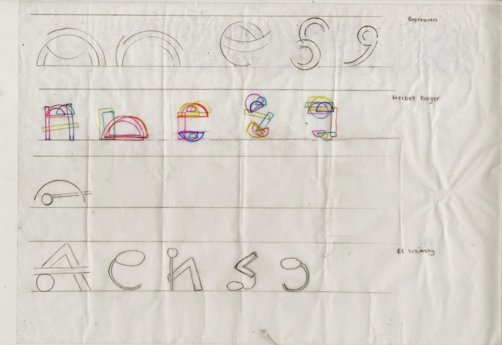
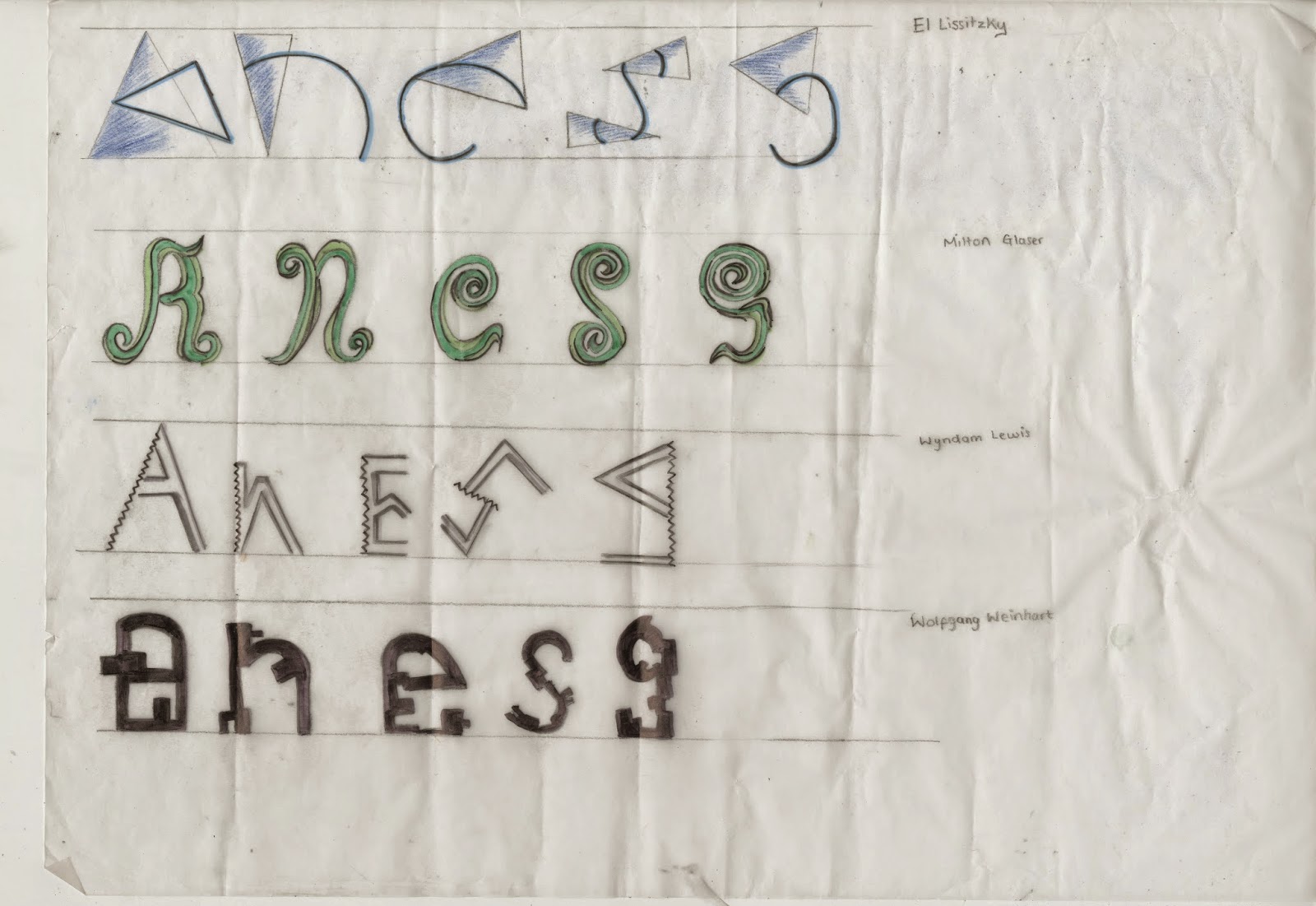
This is one small brief I actually have enjoyed to create our own Font. We was asked to look at different artists work as inspiration and from their work to look at the shapes and patterns which we were then to form the letters A,N,E,S,G. using these. The reason we has to start of with these specific letters was to see if they would work well enough to create the whole alphabet. I started using different mediums, materials and techniques to create my experiments e,g, compass to get a perfect round, rulers for the straight lines, I used fine liners and watercolors to create shadows of light and dark. I used different artist's work to get a mixed outcome with my experimentation's, as I then had a variety of shapes and materials to be working from. 
Experimentation sheet 1

Experimentation sheet 2

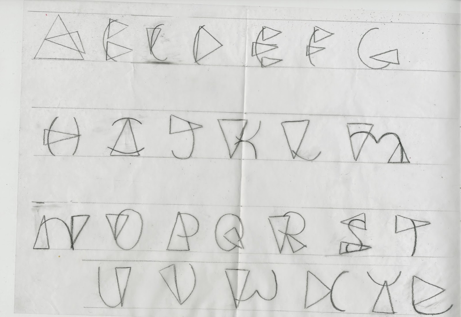
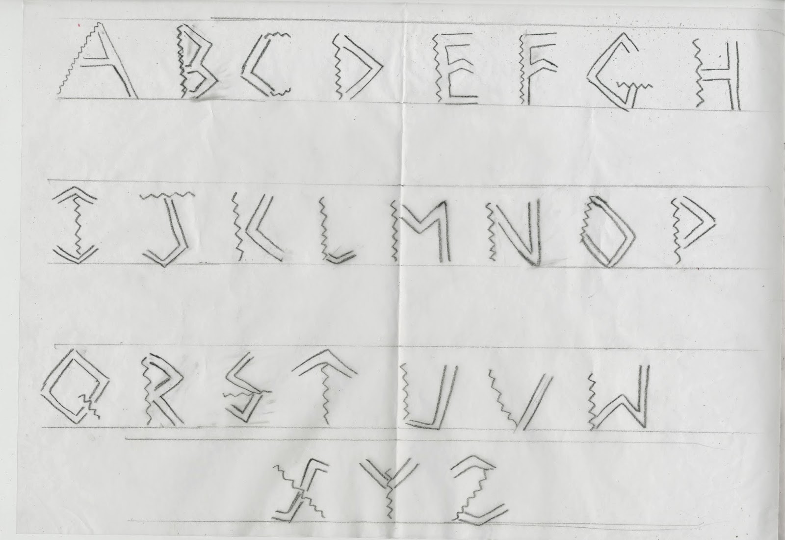
After creating an array of experiments of which I was happy enough to work with my next step was to create 3 full alphabets from these experiments. I choose my 3 favorite's 2 inspired by El Lissitzky and one by Wyndom Lewis. 
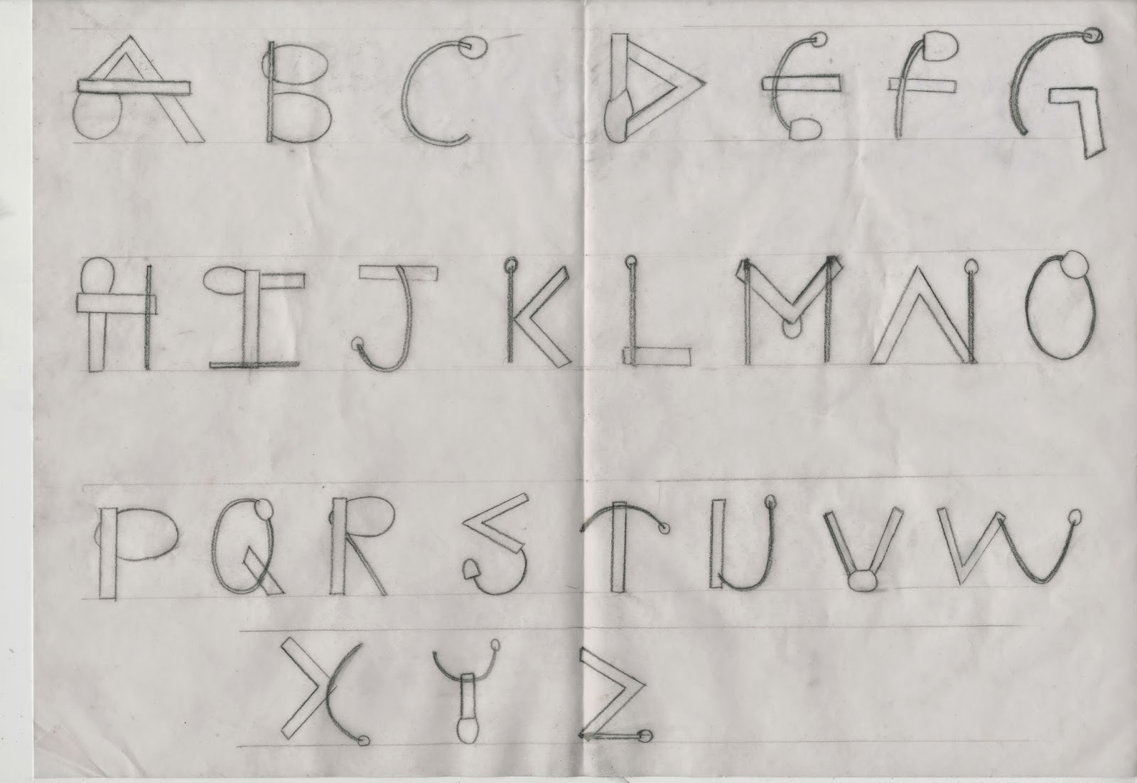
El Lissitzky Inspired Type Font

El Lissitzky Inspired Type Font

Wyndom Lewis Inspired Type font
Once I had completed all 3 type fonts I had then choose which I felt was the best one and my main favorite which was inspired by El Lissizky's work.


 This image above is what inspired my type font. Using the different shapes and curves I merged them both together within each letter, using the thin lines as well as the thin. I also used the aspects of the curvy lines as well as the straight. Inserting the similar shapes into my font with the use of the circles.
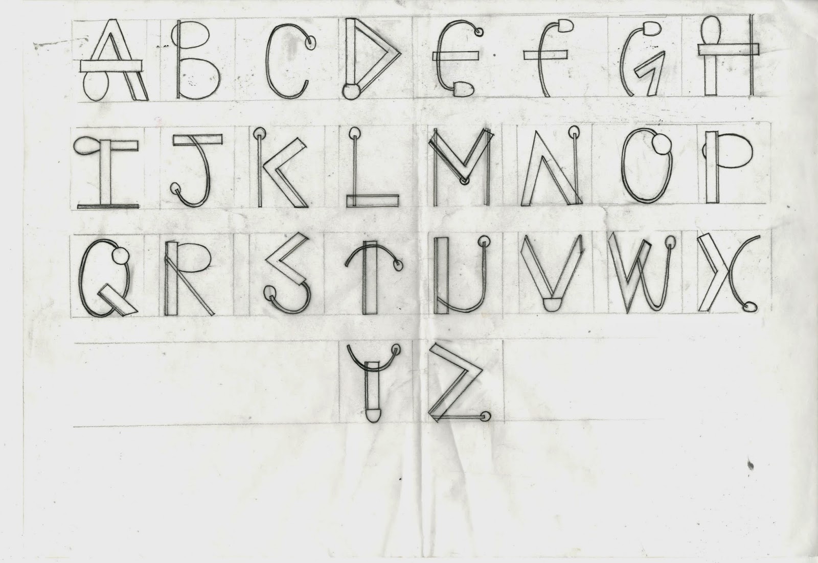
  
Final Type
Once choosing which design I decided to have as my final I once again drew a sketch of the whole alphabet in the same type font but much more precisely using a ruler and going over the final in black fine-liner.Boxing out each letter making them the same size.
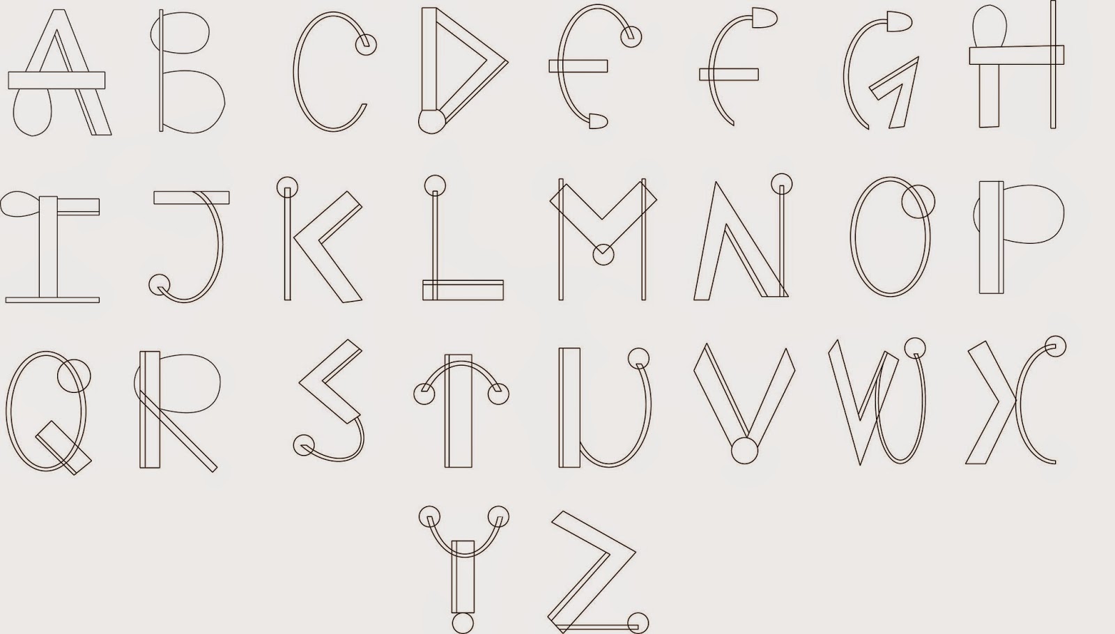
Final digital Type
The next step after I finalized my type font I scanned in the sheet and using Adobe Illustrator I drew out each letter using the pen tool and the line tool. To create the perfect circles I also used the ellipse tool. This gave me a smart and neat look to my finished type. Using Illustrator In the process and production classes have helped me a lot in understand and using the software which I now find better and much more easier to use than pen-tooling on Photoshop.