Showing posts with label Year 1 Adobe Illustrator. Show all posts

Thursday, 9 April 2015

Character Movement

Once again missing this workshop due to being unwell I caught up with this in my own time. Using the software adobe Illustator to create a character which I would be working with to create a short animation. I chose to create a Robot.


My Robot
Using this as my base I pen-tooled every part of the robot onto a seperate layer which would allow me to move each part seperately. Using the 3D tool on Illustator I moved each part in different ways for 10 seconds to produce a small piece of animation. this was quite easy I thought adding movement effects onto each layer adding keyframes to show when they move and stop. The hardest task I found ws how to Import a Illustator file with all the Robot parts on seperate layers, I once again used a youtube tutorial for this which I found very Helpful. I was thinking of maybe to develop this further to add a funky tune in the background to show the robot's dancing.


character movement from Itba Kauser on Vimeo.

Thursday, 19 March 2015

Typography


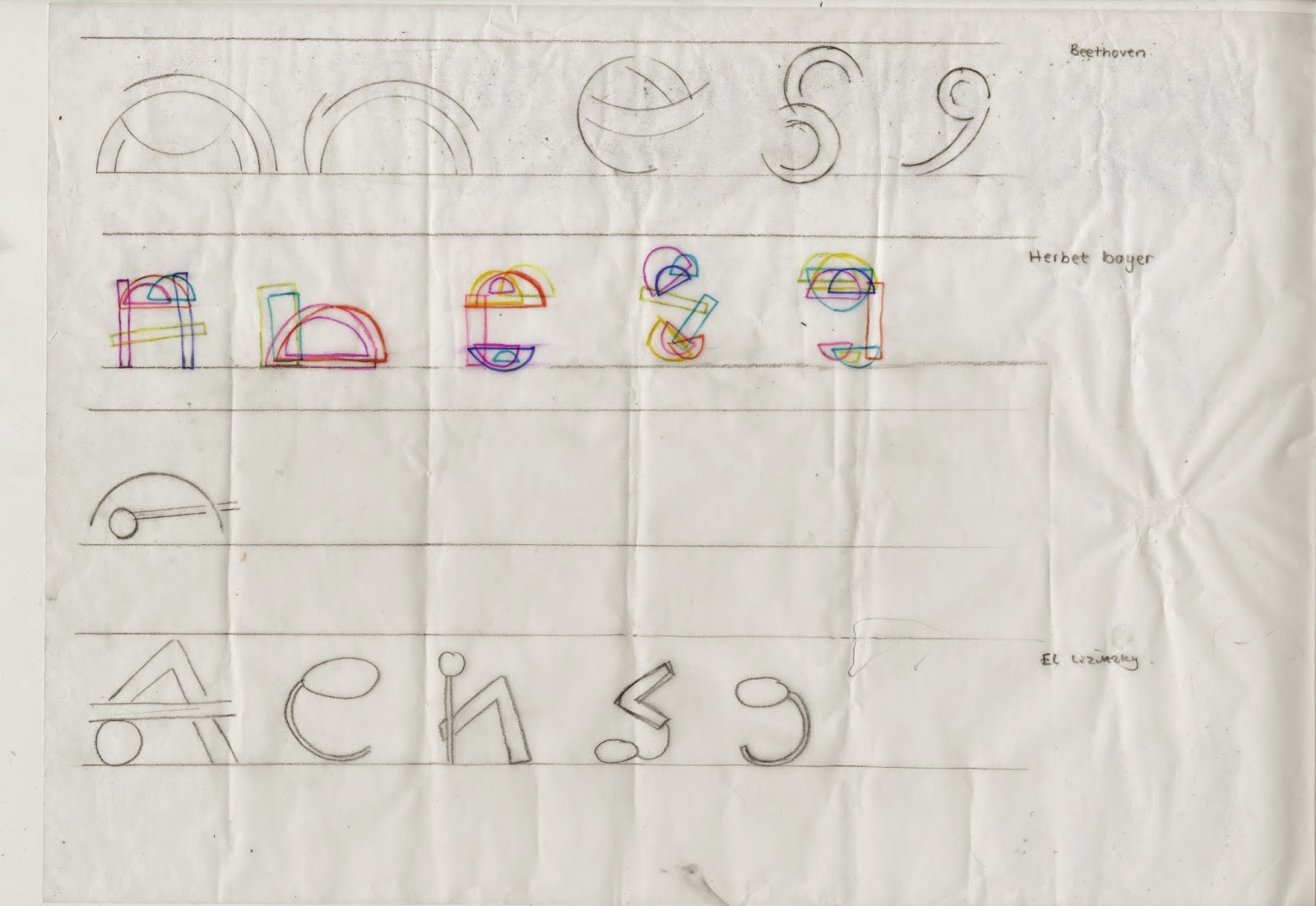
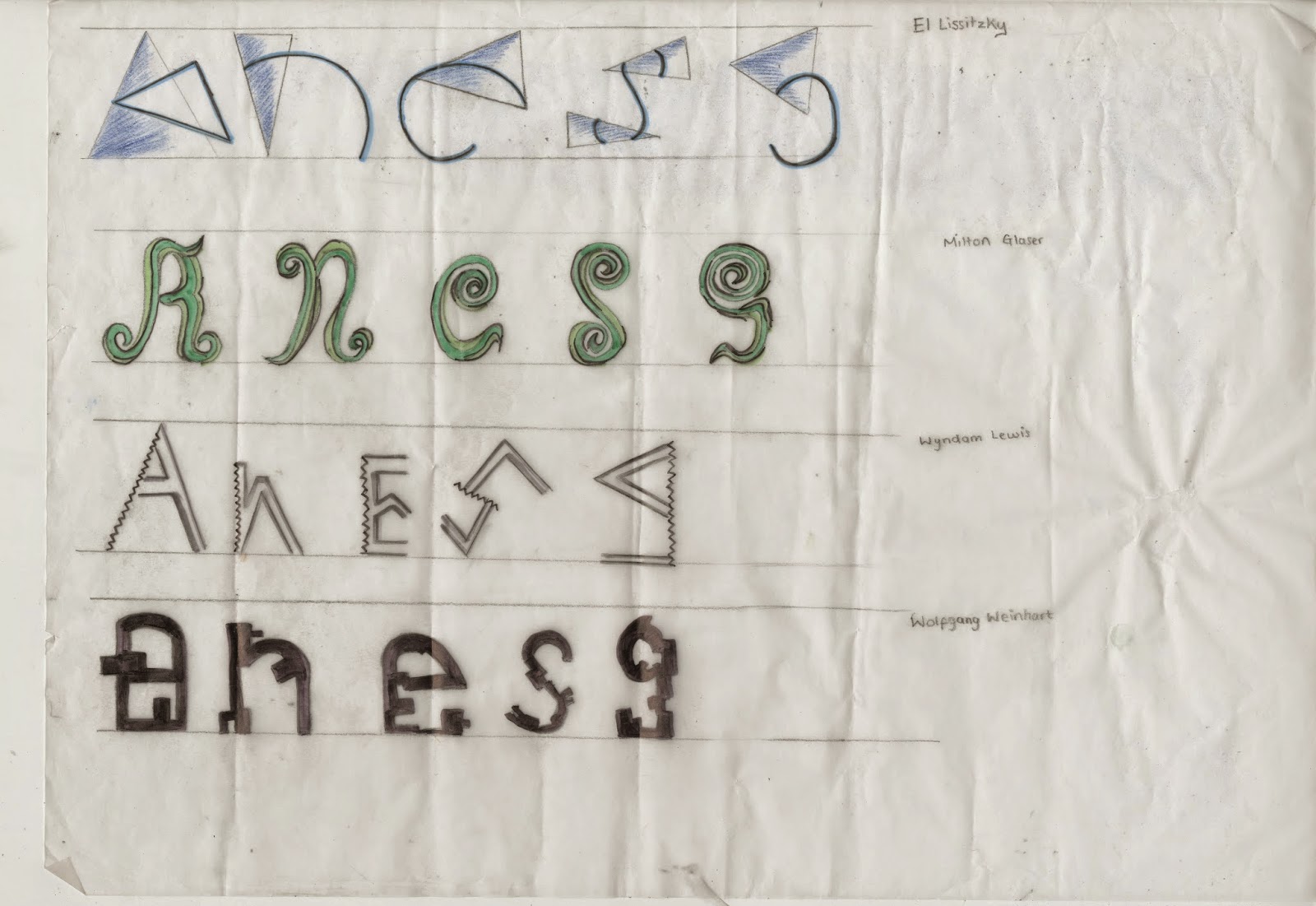
This is one small brief I actually have enjoyed to create our own Font. We was asked to look at different artists work as inspiration and from their work to look at the shapes and patterns which we were then to form the letters A,N,E,S,G. using these. The reason we has to start of with these specific letters was to see if they would work well enough to create the whole alphabet. I started using different mediums, materials and techniques to create my experiments e,g, compass to get a perfect round, rulers for the straight lines, I used fine liners and watercolors to create shadows of light and dark. I used different artist's work to get a mixed outcome with my experimentation's, as I then had a variety of shapes and materials to be working from. 
Experimentation sheet 1

Experimentation sheet 2

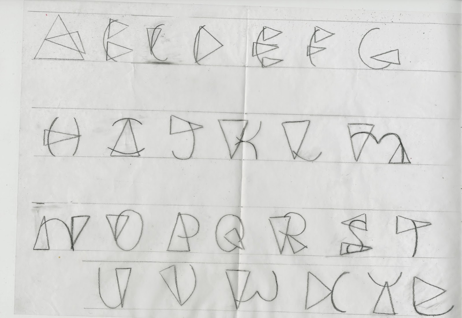
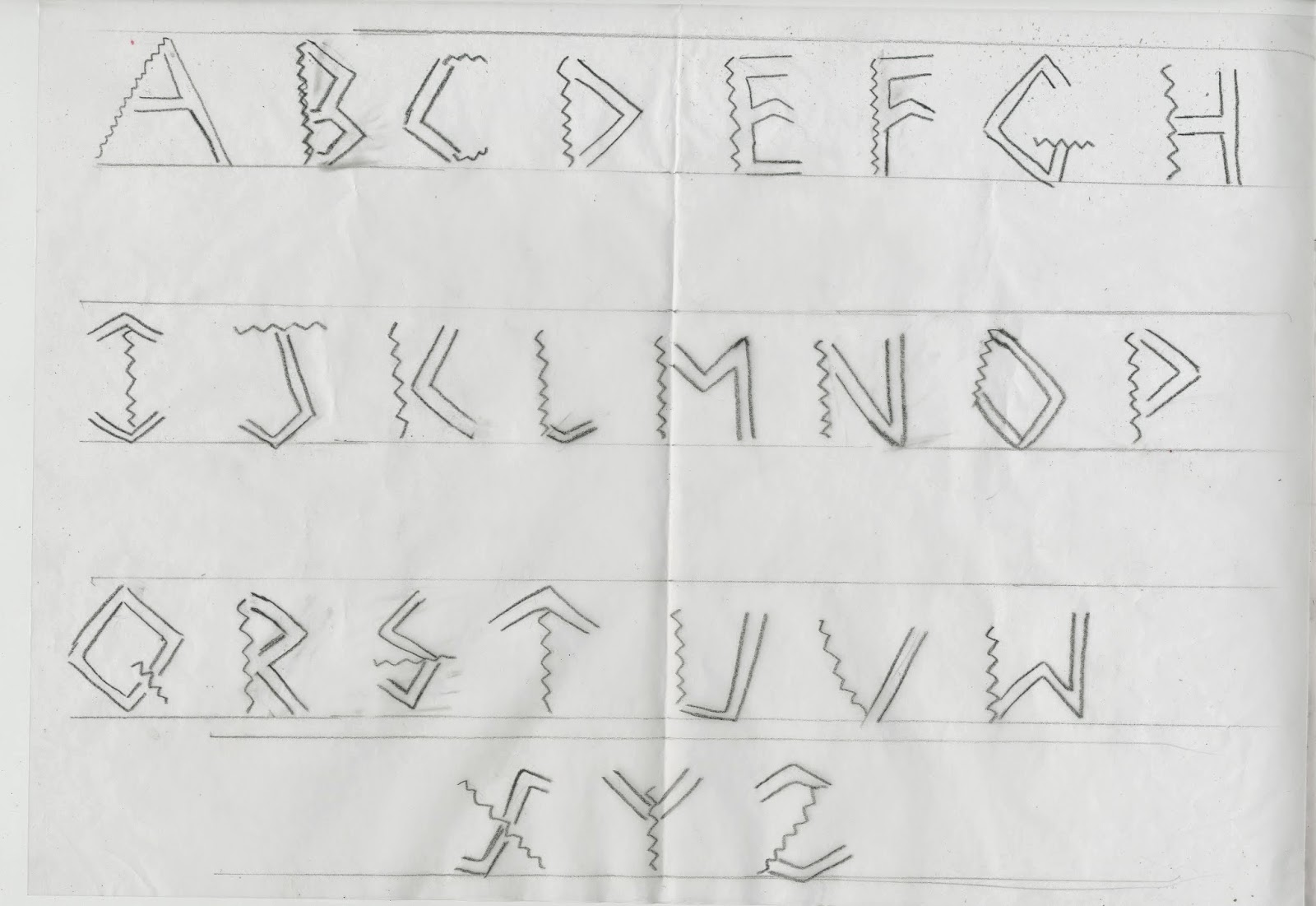
After creating an array of experiments of which I was happy enough to work with my next step was to create 3 full alphabets from these experiments. I choose my 3 favorite's 2 inspired by El Lissitzky and one by Wyndom Lewis. 
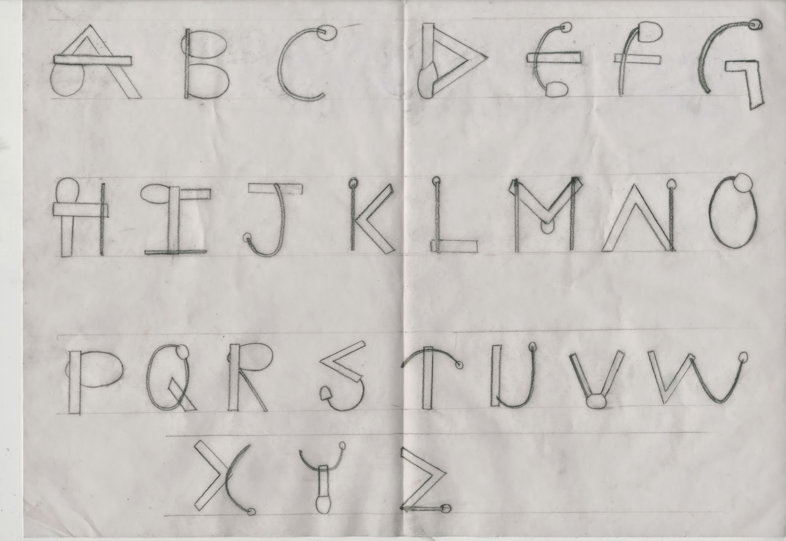
El Lissitzky Inspired Type Font

El Lissitzky Inspired Type Font

Wyndom Lewis Inspired Type font
Once I had completed all 3 type fonts I had then choose which I felt was the best one and my main favorite which was inspired by El Lissizky's work.


 This image above is what inspired my type font. Using the different shapes and curves I merged them both together within each letter, using the thin lines as well as the thin. I also used the aspects of the curvy lines as well as the straight. Inserting the similar shapes into my font with the use of the circles.
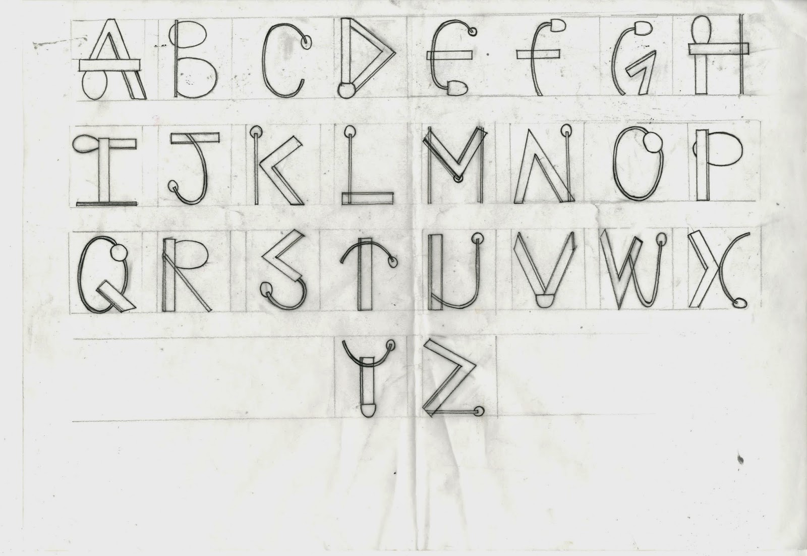
  
Final Type
Once choosing which design I decided to have as my final I once again drew a sketch of the whole alphabet in the same type font but much more precisely using a ruler and going over the final in black fine-liner.Boxing out each letter making them the same size.
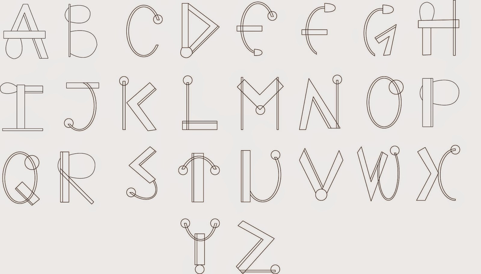
Final digital Type
The next step after I finalized my type font I scanned in the sheet and using Adobe Illustrator I drew out each letter using the pen tool and the line tool. To create the perfect circles I also used the ellipse tool. This gave me a smart and neat look to my finished type. Using Illustrator In the process and production classes have helped me a lot in understand and using the software which I now find better and much more easier to use than pen-tooling on Photoshop.

Thursday, 12 February 2015

The Rocket & Pear

The Rocket


Developing more of our knowledge on Adobe Illustator we Created a rocket vector from 5 simple tools. Following simple process and instuctions I was able to Create a Rocket which I experimented the colour. the pattern stroke and the shadow. 

My final Outcome of the rocket

 I also added a gradient circle in the middle of my rocket to give the perception of a window and ligh reflection upon it. Addjusting the saturation levels to create a brighter more intense colour rocket.

The Pear

For the second part of the workshop we pen-tooled the shape of a pear in Illustrator, using the mesh tool to create a visual image of the pear itself. This part of the process was slightly time consuming as the levels of the shadows had to be more or less precise to gain a visual representaion of the pear. We then added ontop of it a copyright free texture from the internet to give it a more life-like appearance and resemblance to a actual image of a pear.

My final Outcome of the Pear
I really love how the final image of the pear turned out as with the textures it creates different layers for the pear looking 3-Dimensional rather than a simple one layer pen-tool. It gives the pear a much more detailed appearance making it seem like a photograph rather than a pentooled drawing.

Thursday, 6 November 2014

Adobe Illustration

Adobe Illustration

In our First Adobe Illustration session after getting a brief introduction to the software and it's tools. Using the pen tool to draw around each facial feature a layer at a time starting from the face, then hair using simple fill in tools to colour in the pen-tooled areas. Using the circle tools to create the eye with a small pen tool line adding a brush stroke effect to create the eyelashes duplicated the eye and flipped it for a symmetrical eye. Working on the lips using different layers for he red lips the out line the inner colour the teeth and shine. Using the simple curvy pen -tool line adding strokes on the brush effect for the individual hair lines I actually really liked what I came up with.
 
Before using Adobe Illustator for pen -tool previously I had always used Adobe Photoshop. Using the both now I find Illustrator much easier and straight forward, as for illustator you create new paths and layers each time have to make selections and is quite complicated and technical.

Below are a few pieces of work I created in Adobe Photoshop.

My first attempt of using Pen tool in Adobe Illustrator I Pen-tooled a pair of googles going with something simple and quite easy to become familiar with the process.
Getting more complex with detail I then pen-tooled a Avatar.
Much more complex and paying attention to detail for My As Level Graphics. I created a Character from scratch using photography and building upon that inspired by Terminator and Medusa along with abit of Anime. This was my end result which took a long time to get all the deatils in the right places.