In one of our lectures we were talking about emotion and how colour can play a part, looking deeply into the significance of each colours and what mood they represent. This interested me as I studied psychology I understand that there is always a deeper meaning to what we see and that individuals have their own perceptions on things. Colour plays a huge part in the graphic industry as the choice of colour effects the mood as certain colours are associated to certain branding. I did some more research on each of the colours.
Black and White -
These two colours are considered as power colours, they're used in official matters and are taken very seriously especially in legal matters as the saying is "I want this in writing write them down in Black and White".
However these colours also represent the unknown, (fear of) death, innocence, peace, day and night, birth and death, good and evil.
These colours can also be used in fashion to make a statement of looking smart, cool or classy. 'Black tuxedo with a white shirt black tie, black boots and black sunglasses'.
These colours are also used in clinical based environments, as well as street signage to be informative and simple at the same time.
In China these two colours represent the Yin & Yang symbol. A important symbol represent two opposite forces e.g. male/female, sun/moon, light/dark, North/south, right/left etc.
Red -
A primary colour which has a few different connotations. It is positively associated to the colour of Love, lust, romance, sexuality, desire and passion. It is energetic colour full of energy, requires us to take action, some form of movement.
However it also has a negative connotation which symbolizes hate, anger, revenge, blood, murder, destruction, aggression.
In china the colour Red is the colour for good luck.
Restaurants use the colour red to stimulate the appetite as it is known for increasing food cravings.
In the Indian culture red symbolizes purity and marriage as the brides wear red gowns on their wedding.
Warning and danger signs use the colour red to show its highly important and must be followed.
Orange -
A energetic colour merged with the physical power from the colour red and the mental power, cheerfulness and joy of the yellow.
It's associated with cheerful, extroverted, uplifting and rejuvenating the spirit.
A motivational colour to help keep moving forward during tough economical circumstances or maybe a divorce.
It's con-notated with the Weather and Summer season, giving a warm exotic atmosphere. Also the Autumn season of the season of change with the orange leaves, a new beginning.
The colour also links with social communication, a two way conversation, as it is warm and welcoming, friendly e.g. tango logo sign is orange.
Linked with a balanced energy between the two colours red and yellow a balance between anger and happiness, It is courageous to take responsibility, a risk representing enthusiasm.
Yellow -
A bright colour to represent happiness, joy, enlightenment it's illuminating and uplifting being the lightest colour in the spectrum.
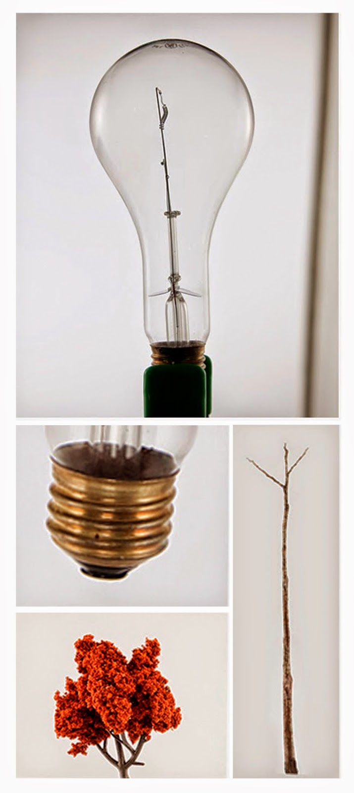
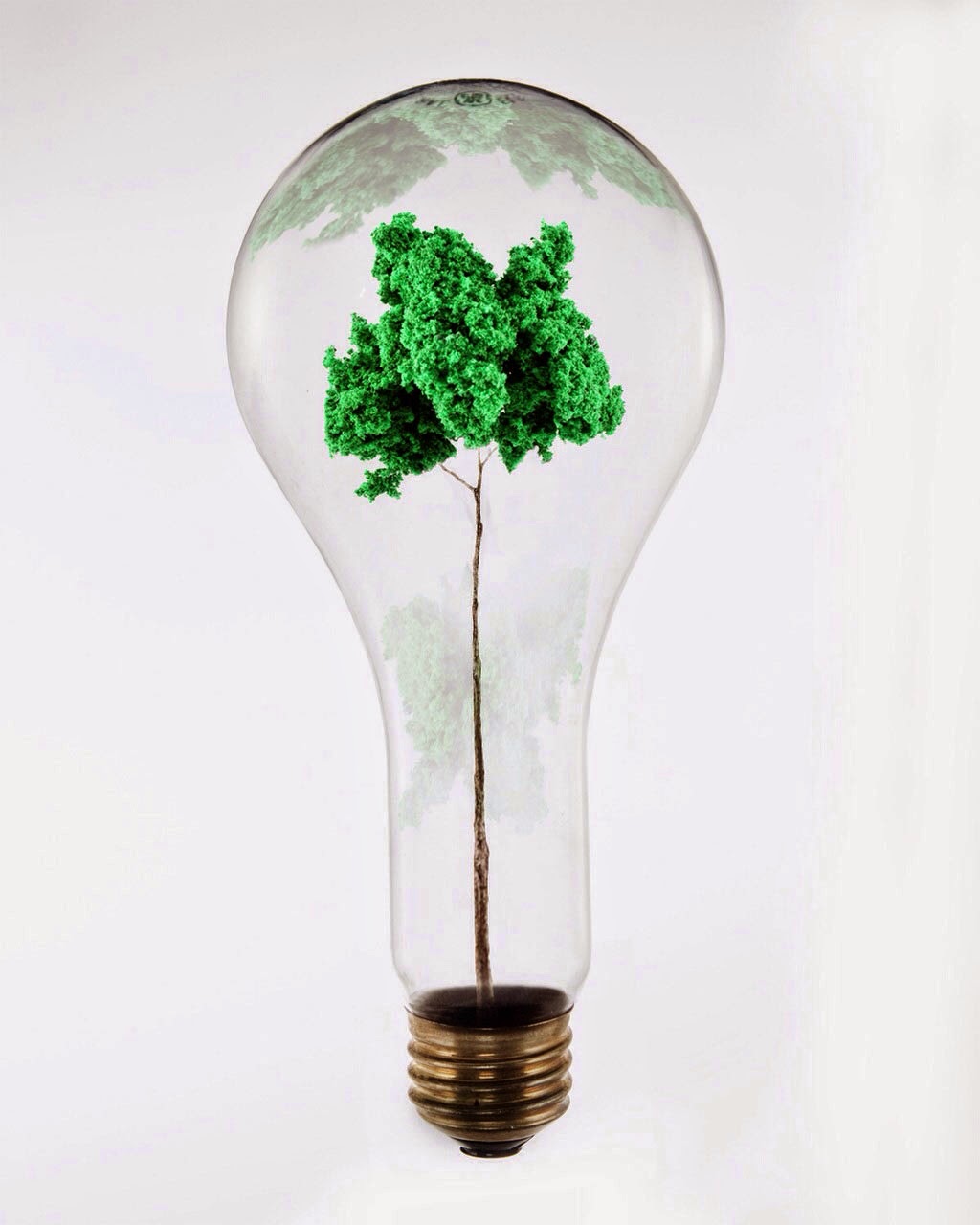
It inspires the though of a new idea (light bulb), original thought, inquisitiveness, a practical thinker to help in doing things.
Represents the Season Spring with the growing of the Daffodils.
It is a non - emotional colour as it targets the head not the heart, being optimistic and engaging into social interaction, used as a form of expression. It is used to gain confidence.
It also helps recall information as it is bright and eye-catching it's more likely to stick into the memory than any other colour, e.g. exam notes (highlighter or colour paper)
As it is a highly visible colour is is mainly used in pedestrian crossing as well as life jackets in neon yellow to be visible to others around.
Green -
Emotionally positive colour giving us the ability to love and to nurture. A colour embracing the earth as it is mainly associated with the Nature, life, afresh.
Main colour for recycling re-using to maintain a healthy life,for growth, re-birth, renews and restores.
The colour of prosperity and abundance a combination of the clarity and mental function of the yellow mixed with the calmness and insight of the blue.
The colour highlights stability and endurance, a peacemaker the ability to hope and anticipate of things to come.
It also relates to the Business world e.g. the real estate and property department as it gives a sense of safety and assurance.
However there are also negative connotations which link to envy, decay, possessiveness and materialist things.
Blue -
The colour best to symbolize trust, responsibility, loyalty, reliable, quiet, sincere safe and secure, in control, honest. The colour to represent wisdom, faith religion.A universal colour it is nostalgic and is difficult when comes across change.
Blue is the colour of communication, the freedom of speech the public speaker,(used in politics as the colour of the Conservatives).
Blue is a soothing, relaxing calm colour, the colour of the ocean and sky, it represents tranquility.
It also represents wealth, with all the connotations of the safety it is the colour to represent most banks, e.g. Barclay's, Halifax, Nationwide, Natwest etc. To build the trust foundation with their customers to communicate their message using colour.
Stereo-typically blue is associated with being a masculine colour as it represents the male gender e.g. a newborn baby boy would be dressed in blue.
Also having some negative connotation blue is associated with depression, melancholy, sadness.
Looking at Black Bear Design
Searching the net for different colour theories I came across Black Bear design a graphic agency who explain there use of colour, it's uses which i found was very interesting to see facts and figures of which colour is most used and how it is used with in the Graphic Design Industry.
 |
| I love how they have included statistics to show which colour is being used more, which brand is more recognized due to their colour as well as breaking down there own theory of what each colour symbolizes. |
 |
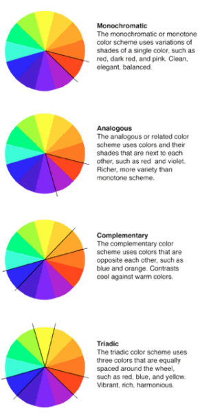
| In-depth and more sophisticated analysis of the colour wheels with detailed terminology labeling the positioning of colours. |


