Saturday, 29 November 2014

Thumbnail Visuals

After the story board and mood boards I then started to create some thumbnail visuals using the Grid system as a guide to create the layout for my story type. 
The boxes with the cross and clear  boxes represent a Image, lines in columns following the grid system representing text.

Thumbnail Visuals
Using this method I feel allows to develop and experiment with the different possible layout outcomes. It makes it easier to set out the composition of the spread.  

Once we did small thumbnail visuals I choose for out of these and created 4 larger Thumbnails A3 size. Still using the grid system I used actual type from my story cut them up in pieces matching the size of the column grid to create a well structured composition of the type.   


Thumbnail Visual 1

Thumbnail Visual 2

Thumbnail 3

Thumbnail 4
I used different fonts and sizes to create different compositions using the grid system as a structure which I worked on top to create columns for my text,  

Thursday, 27 November 2014

Newsletter

A small exercise in using Adobe In-design for the first time we went though the whole program with the basics of going over the job of each tool. Learning about the different pages with it having a master page where on that anything you insert on the A master page will automatically appear on every page.

To start with this we added 3 columns and boxes which we used as guidelines for the text images and the headline.Using the type tools we inserted the text changing the size font colour and size to fit it with the appropriate medium.  
Final Magazine Layout Page
To experiment with the Image and how to get the text around the Image you deletes all the background Into Photoshop and transport it over track the edges and then alter the type to go around the edges in the measurements you want. I found this very hard to use as it was my first type so I was trying to get familiar with the tools.

.  
Experimenting with the different tools

Experimenting with the different tools I drew a shape and inserted text onto the path of the shape but also with the shape to experiment with the different functions the software offers.
On my second experiment I In-versed a image into the type which I would normally do in Photoshop and adjusted the shape of the type which i thought was pretty cool. At the moment i'm having slight difficulty in using this software but as I use this more I hopefully will be able to use this easily with no trouble.

Thursday, 20 November 2014

Adobe After Effects

Process and Production - Adobe After effects

Task 1 - Short Horror Clip

To my first draft of the clip I used that to work with to add effects over the Images downloading copyright free effects from cute stock footage.com and downloaded 2 effects which I overlaid on top of each other. A circle bubble effect and a horror grunge effect which creates the horror theme to my mini clip, also i added layer effects playing about with the opacity to get the effect i wanted to create. To overlap the images to create a smooth transition between the changing of the images I adjusted the opacity of images as well as adding key frames. Found this really helpful and loved the final short clip. (Shown Below)


Final after effects clip from Itba Kauser on Vimeo.

Monday, 17 November 2014

Advertising Lecture

Lecture Notes

Lecture Notes

After the Lecture on Advertising I conducted more research to know more about the topic as it is a huge sector of Graphic design and one option of my future career.

Firstly What is Advertising?
It is the activity or profession of producing advertisements for commercial products or services in order to make people aware of a certain product, service, company etc.

Forms of Advertising

I collected a few charts from google to show the different forms of Advertising and which are being used more, which forms are more successful than the other.


Trust In Advertisement
This Graph is measuring the trust ability in each different form of advertising. This shows that recommendations is a more trusting form than a mobile text. As mobile texts people are most likely to click of the pop ups as they are seen as annoying whereas recommendations are from experience and are most likely to be acknowledged.


Similar to the bar graph this shows once again the different forms of Advertising and which is most successful than the other. This however also shows whether the percentage has increased over the years or decreased over the years from 2007 to 2013.


Impact of advertisement in the wider UK Economy -


Advertisingpays Infographic
Infographic of the impact of advertising in the wider UK economy (Jan 2013)

The main findings of the report were:

Advertising and growth

  • Advertising adds at least £100bn to UK GDP by raising the level of economic activity and boosting productivity
  • Advertising boosts competition
  • Advertising matches buyers and sellers more efficiently
  • Advertising accelerates the growth of new businesses and ideas
  • Higher levels of advertising spend increase GDP
  • On average, £1 of advertising spend generates £6 for the UK economy.

Advertising and the creative industries

The UK advertising industry is central to the UK creative industries. Outside of the public sector, advertising is a main source of revenue for both on and offline media:
  • 1/3rd of UK television revenues come from advertising
  • 2/3rds of UK newspaper revenues come from advertising
  • 90% of UK Google revenues come from advertising
  • Advertising employs the services of other creative industries; from music, fashion, film production and special effects, to animation, games and photography, and provides steady income for some of the UK's most talented artists.


Advertising and employment

  • 550,000 UK jobs depend on advertising - 268,000 in advertising agencies and client companies, 83,000 in support services to advertising and 200,000 across the wider economy.

Advertising and export

  • Thanks to its international reputation, UK advertising helps to export over £2bn in advertising services each year. In addition, successful advertising enables UK brands to enjoy strong international recognition, enabling the UK to export a much wider range of goods and services.

Advertising Standards

  • The UK’s Advertising Standards (ASA) model is the global gold standard for self-regulation.
(Above Information from - http://www.thecreativeindustries.co.uk/industries/advertising/advertising-facts-and-figures/how-advertising-fuels-the-economy )

Looking at the facts and figures show that Advertising is a huge economy employing over 550,000 jobs and that's just in the UK. It is a phenomenal aspect to industry which allows it to succeed as every company to be known uses the help of Advertising it is like the middle man between a company and it's customers. It is highly successful making over 100bn a year.


So what is 'Integrated Advertising'? from The Digital Baker on Vimeo.

Searching on What Advertising is I came across what I think is a amazing video describing what Advertising is and how it all started using which technology all in a manual technique using a cardboard box. I think this is brilliant! Love he technique they have used it's effective as it doesn't clash with the advancing of technology within advertisement.

Linking with advertising I researched to see which brand is the most popular and cam across this link.

http://www.bestglobalbrands.com/2014/ranking/

This shows the top best global brands of 2014 and how much they make and profit. This clearly shows how much each brand is being advertised and therefore used depending on the success rate of each brand.


Thursday, 6 November 2014

Adobe Illustration

Adobe Illustration

In our First Adobe Illustration session after getting a brief introduction to the software and it's tools. Using the pen tool to draw around each facial feature a layer at a time starting from the face, then hair using simple fill in tools to colour in the pen-tooled areas. Using the circle tools to create the eye with a small pen tool line adding a brush stroke effect to create the eyelashes duplicated the eye and flipped it for a symmetrical eye. Working on the lips using different layers for he red lips the out line the inner colour the teeth and shine. Using the simple curvy pen -tool line adding strokes on the brush effect for the individual hair lines I actually really liked what I came up with.
 
Before using Adobe Illustator for pen -tool previously I had always used Adobe Photoshop. Using the both now I find Illustrator much easier and straight forward, as for illustator you create new paths and layers each time have to make selections and is quite complicated and technical.

Below are a few pieces of work I created in Adobe Photoshop.
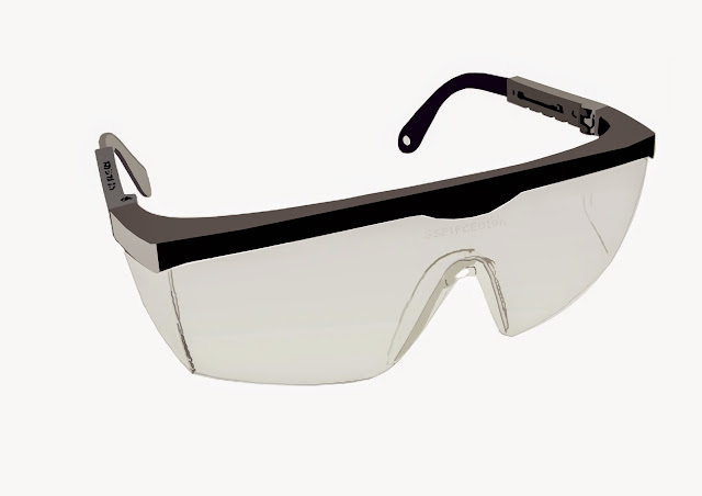
My first attempt of using Pen tool in Adobe Illustrator I Pen-tooled a pair of googles going with something simple and quite easy to become familiar with the process.
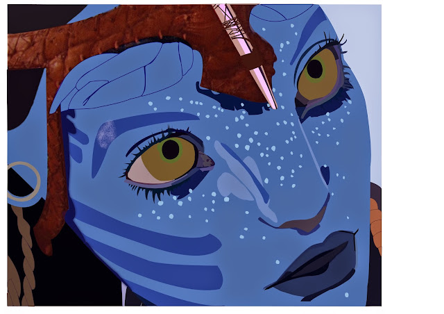
Getting more complex with detail I then pen-tooled a Avatar.
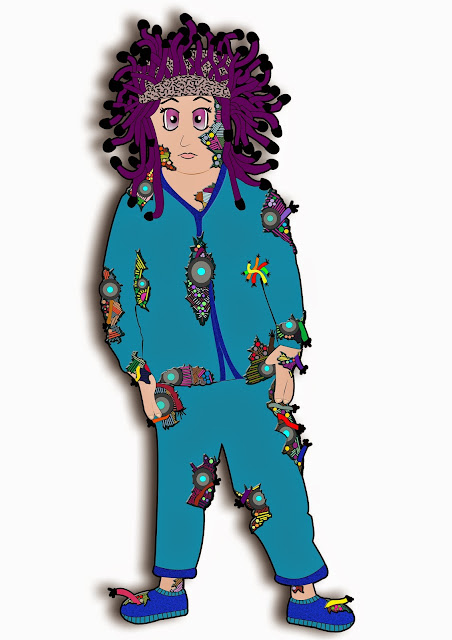
Much more complex and paying attention to detail for My As Level Graphics. I created a Character from scratch using photography and building upon that inspired by Terminator and Medusa along with abit of Anime. This was my end result which took a long time to get all the deatils in the right places.